A tooltip allows you to display further informations to the user when needed. It can also be used to explicitely specify a visual element like an icon.
Usage
Please follow these simple rules when using tooltips:
- tooltips must be used near the highlighted content
- tooltip text must be short (1 or 2 lines maximum)
Variations
Icon tooltip
This kind of tooltip is displayed when the user needs a little more information, to understand an icon for example. It is generally triggered with an informative icon placed near a text element.
Text tooltip
Text tooltip are additional content used to define an unclear term.
Behaviors
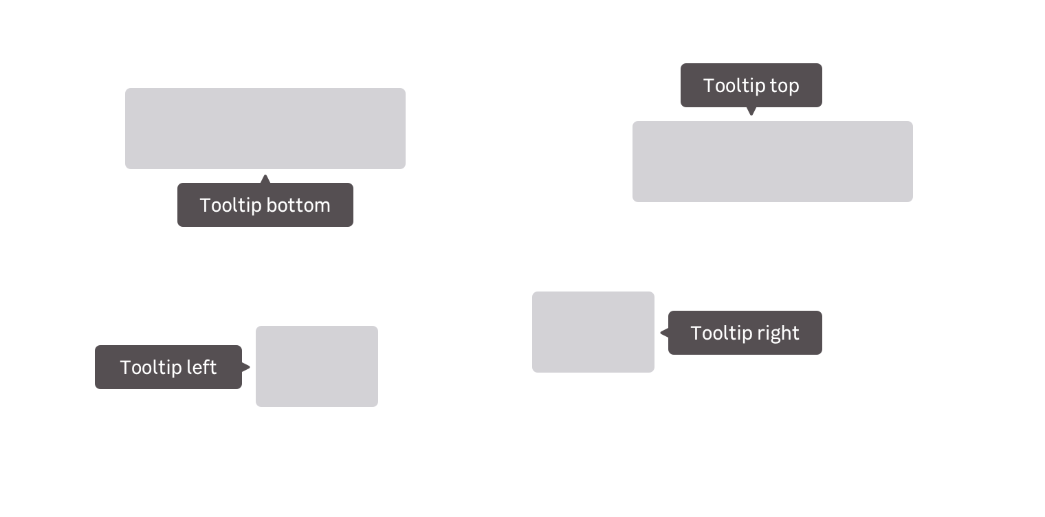
Directional
We provide four tooltip positions to suit your needs at best:
- Left
- Right
- Top
- Bottom
Appearance
Tooltips can appear in several ways depending on the context and the device it is displayed on. You can have tooltips appearing on hover, on focus and on click.
Spacings for designers
Read more about spacings in this design documentation page
Do's and Don'ts
Show read-only content in tooltips.
Don't hide essential informations in tooltips.
Never use interactions in tooltips like images, links and buttons in tooltips.