Heading styles
The heading pattern provides basic typographic styles for your page titles, also known as H1. Each heading has its own sizes depending on the breakpoints.
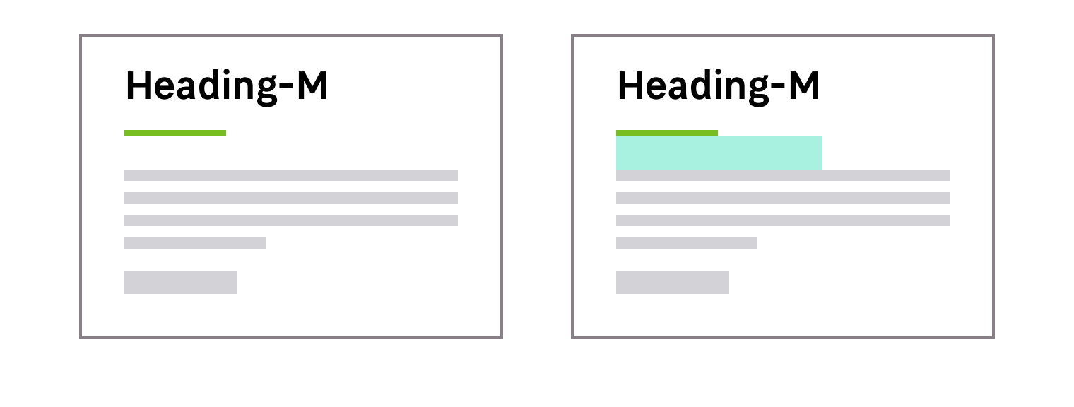
There are two different types of heading styles for Mozaic. One is a text only and the other style is a combination of a text and an underline. Read more.
Recommended sizes
Heading Medium
Heading medium are supposed to be used as the default heading style for your pages. Every breakpoint has a default value that should be used in most cases.
| Breakpoint | Heading size |
|---|---|
S (320px and up) | 28px (1.75mu) |
M (680px and up) | 34px (2.125mu) |
L to XL (1024px and up) | 41px (2.5625mu) |
Specific needs
This heading styles system still allows you to answer specific needs depending on the content of your pages or your section.
Heading Small
These heading styles sizes are the smallest sizes you can use for your titles.
| Breakpoint | Heading size |
|---|---|
S (320px and up) | 23px (1.75mu) |
M (680px and up) | 28px (1.75mu) |
L to XL (1024px and up) | 34px (2.125mu) |
Heading Large
Mozaic provides large heading styles when you need to make some titles stand out. You can find these cases on landing pages for example.
| Breakpoint | Heading size |
|---|---|
S (320px and up) | 34px (2.125mu) |
M (680px and up) | 41px (2.5625mu) |
L to XL (1024px and up) | 49px (3.0625mu) |
Variations
Font weight
There are two different font-weights available for your text headings.
| Font-weight | Usage |
|---|---|
| Regular | Use this font-weight for your common text headings |
| SemiBold | This font-weight allows you to visually emphasise your text headings |
Text colors
You can use the darkest or the lightest font color depending on the background color. This choice must be made with accessibility in mind.
Underlined headings
In some cases, your title can be a combination of a text and an underline. These underlined headings can be useful when you need to give more importance to your heading or make visual separations.
Please note that underlined headings are available in SemiBold only.
Underline colors
The color of the underline allows you to give visual context to your page or section.
| Color theme | Usage |
|---|---|
| Primary-01-500 | For LEROY MERLIN title pages on light and dark backgrounds |
| Primary-01-200 | For LEROY MERLIN title pages on Primary-01-500 backgrounds |
| Primary-02-600 | For LEROY MERLIN Campus title pages on light backgrounds |
| Primary-02-200 | For LEROY MERLIN Campus title pages on dark backgrounds |
Padding bottom
Headings include a default padding bottom to keep the right vertical rhythm between the interface elements.
Alignment
You can find different aligments, left / center/ right for your headings.